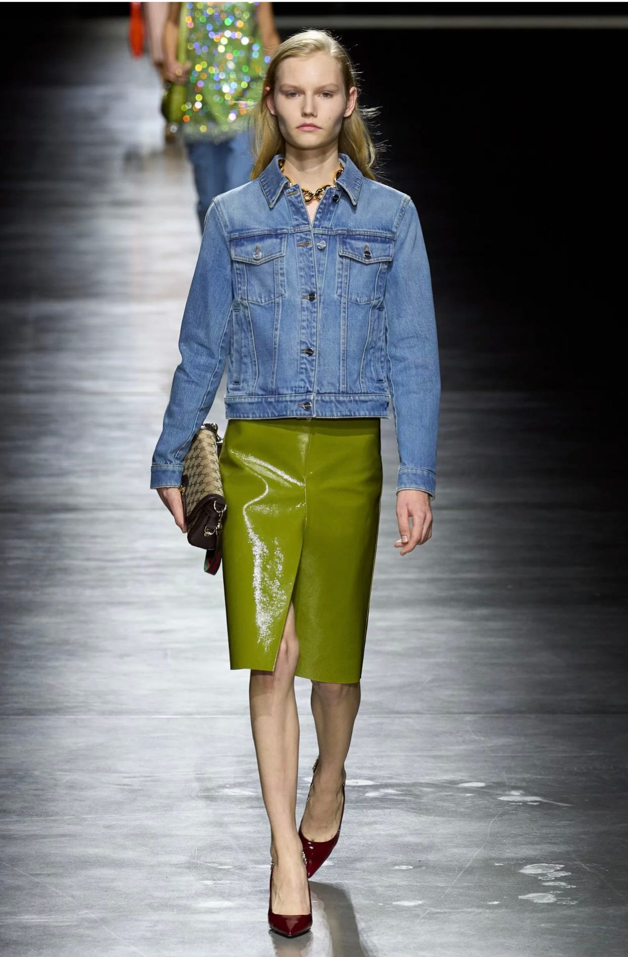
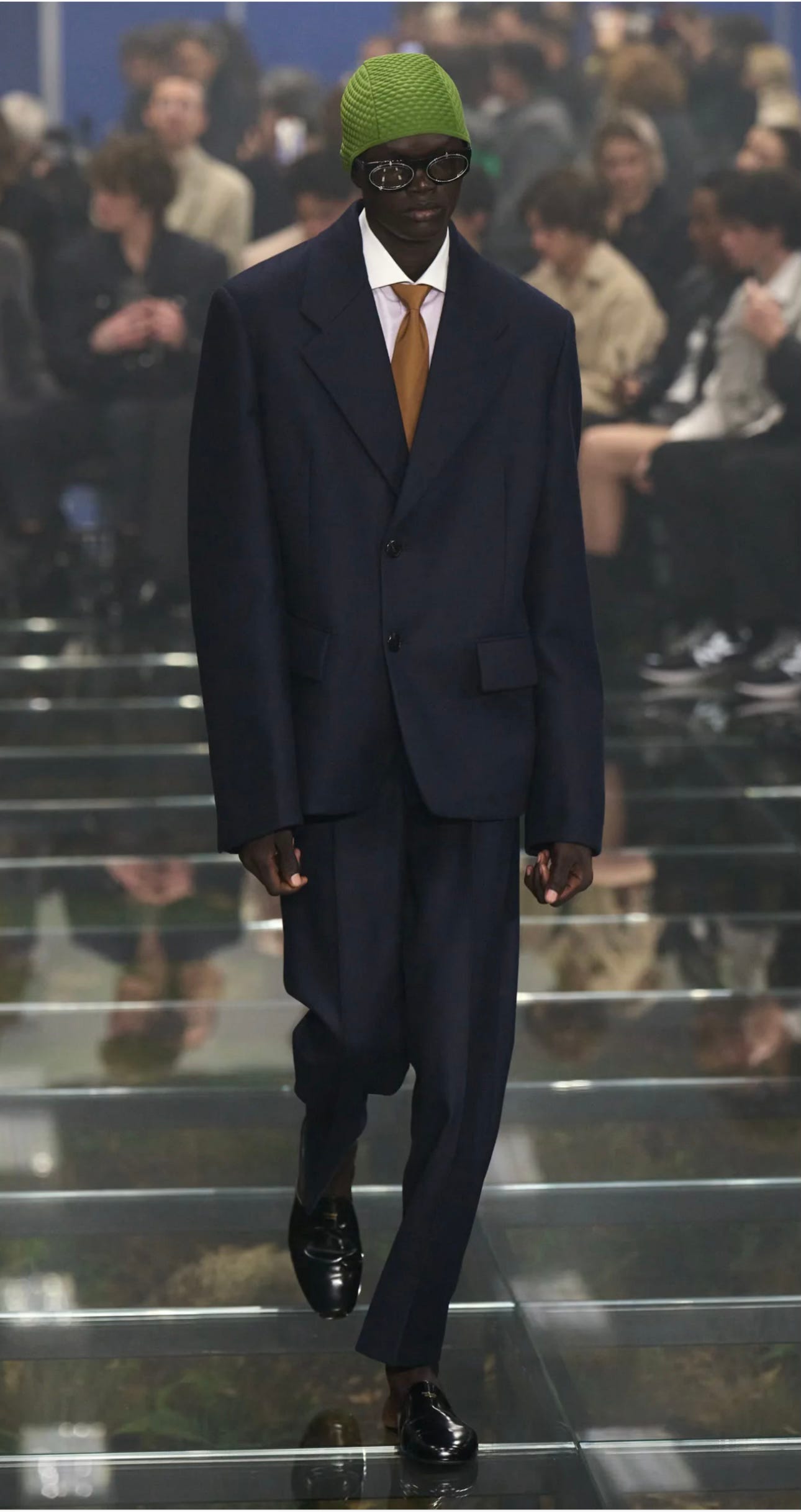
Slime green is the new red
And what makes an accent color stick
For an accent color to have staying power, it has to be either understandable to any eye that meets it — like a shade of Yves Klein blue (cobalt, basically, and coming for us), or fire engine red (already here for us), or it has to be just off enough that your eye can’t help but try to understand it.
I’ve had this idea in my mind for the last several months that green is the new red but I’m realizing now that to put it in these terms kind of dismisses the way the trend cycle works these days. Trends don’t really die and get replaced by new ones anymore so much as they do develop this buildable quality. What I mean is, they stick around and get stacked on. New variables enter their ether and this gives them a freshness that extends their lifespan. The way this is playing out right now is with the growing popularity of a few other colors. The ones my senses have plugged into: cobalt blue, violet purple and green.

But not just any green — I’m not talking about Bottega’s shade of electric Reptar, or the classic true hue from the secondary wheel.

It’s not even one among the more timeless and tasteful shades — not quite sage or hunter or olive or moss. It’s more like slime green.
I know we’re out of the era of minimalism because when I get dressed, I keep reaching for color but not so much of it that I look like a cartoon character, just enough to add a some levity to an otherwise straightforward look.
And with red as the big-ticket accent color most brands, retailers, stylists and shoppers are focused on for the season, I find that the colors gravitates towards naturally respond to it. I’ll probably break them all down but today I’m focusing on the slimy shade of pistachio green (often called Prada-green among fashion people) that has been permeating many of our wardrobes for months already.

It’s a warm color, which makes it quieter than and therefore a good compliment to red, but it’s also got a bit more sass. So you combine the properties of green, which reflect abundance and expansion and grounding and earthliness, the solitude that comes from peace and quiet, then you add the spice of its weird tonal range from mucus to Kermit and you have what I call measured sauciness.

There are some specificities about how to wear it, the first of which encompasses the key points about how it builds on top of red, almost giving new qualities to the grandfathered accent color.
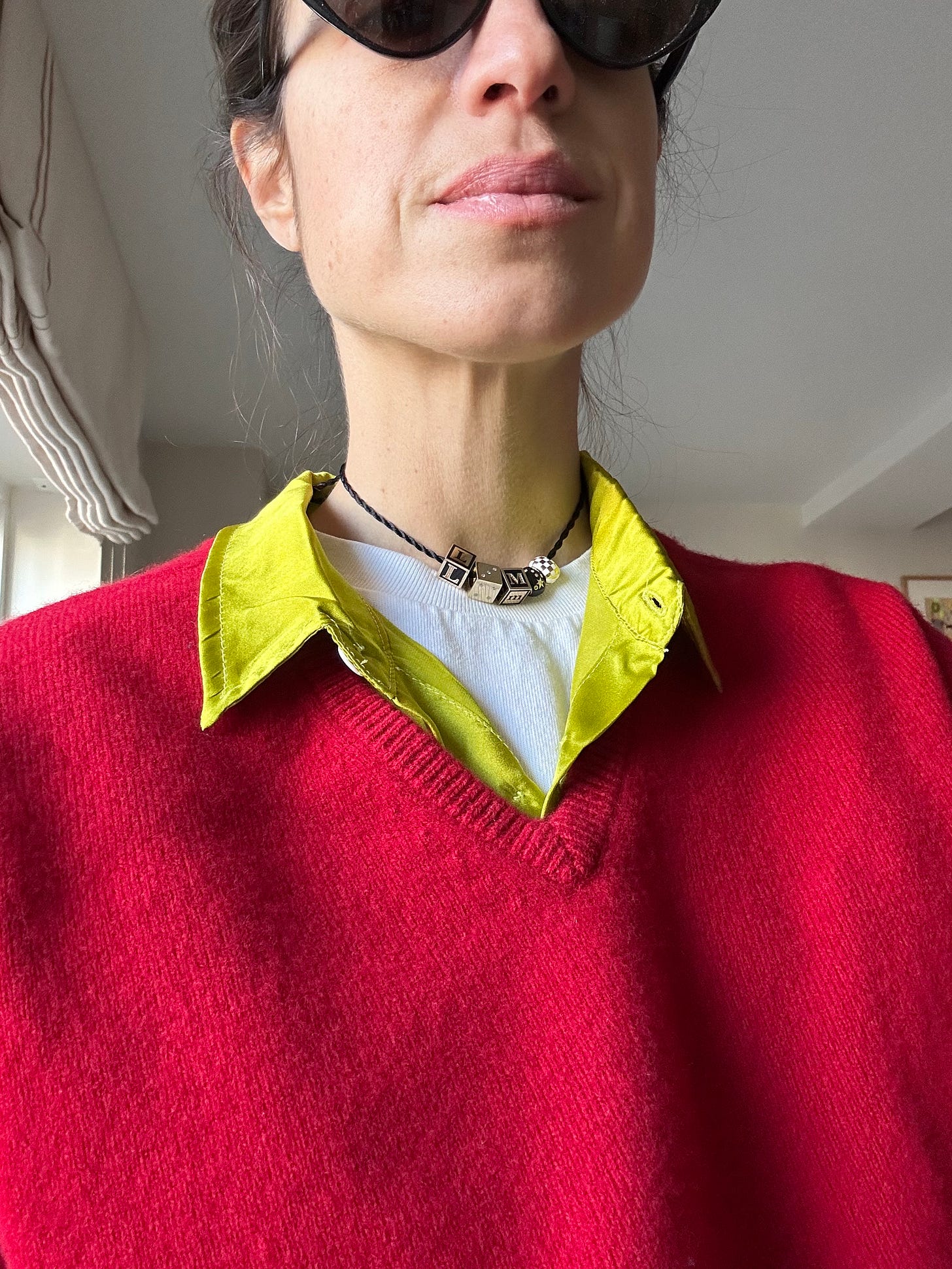
See what I mean?
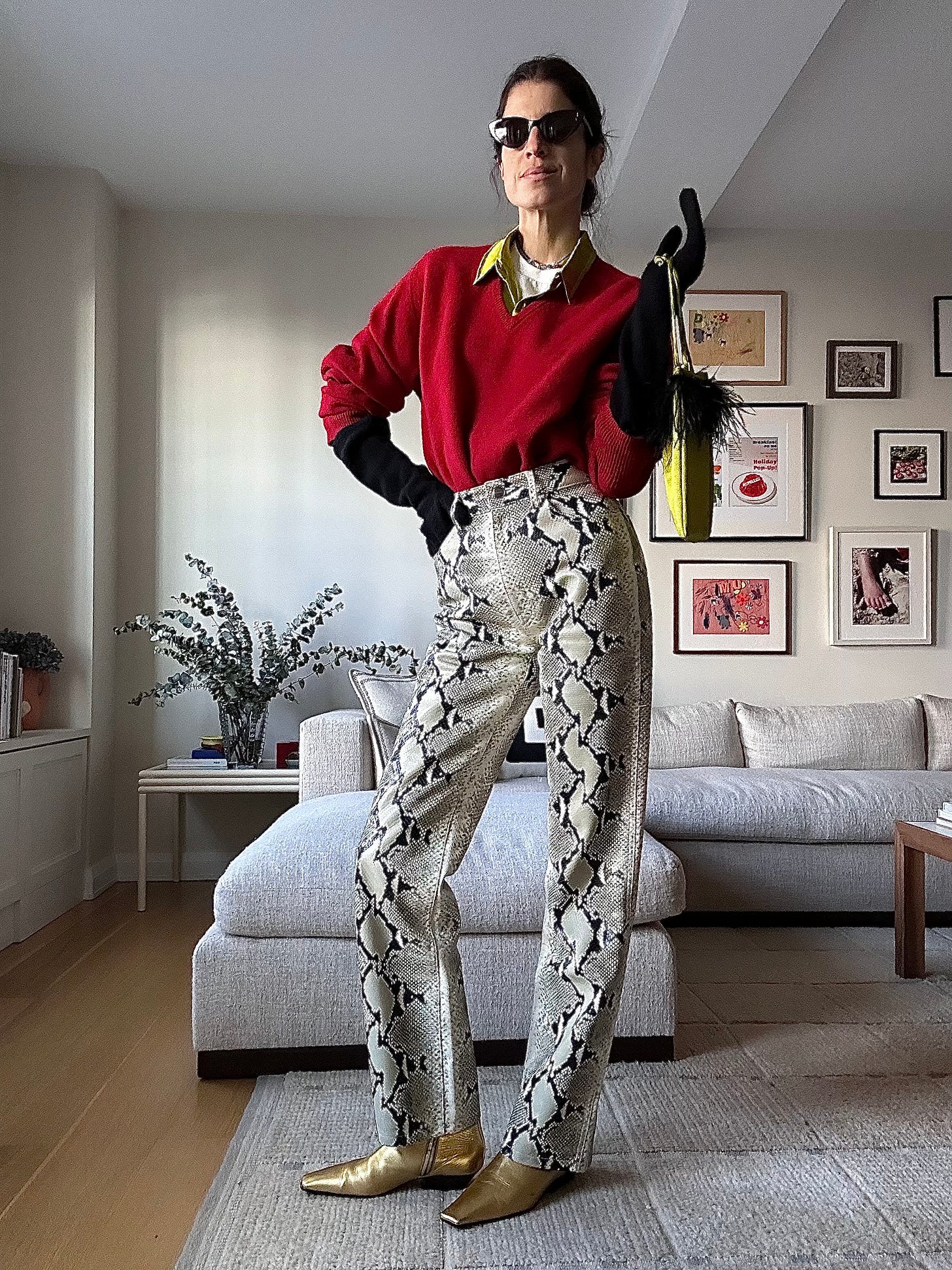
But what does it do for an outfit with no red? Can it become its own trend on the wheel? Maybe! When you wear slime green as the main event, it’s the punch in the face you are often seeking to remember you’re alive in the dead of winter.
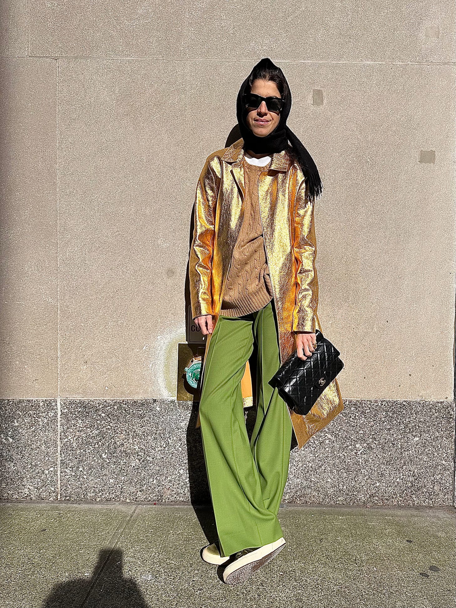

And you don’t have to have a gold coat to drive this point home — the green is good with shades of white, camel, khaki or heather grey. (The common denominator here being a light-wash neutral as the springboard.)
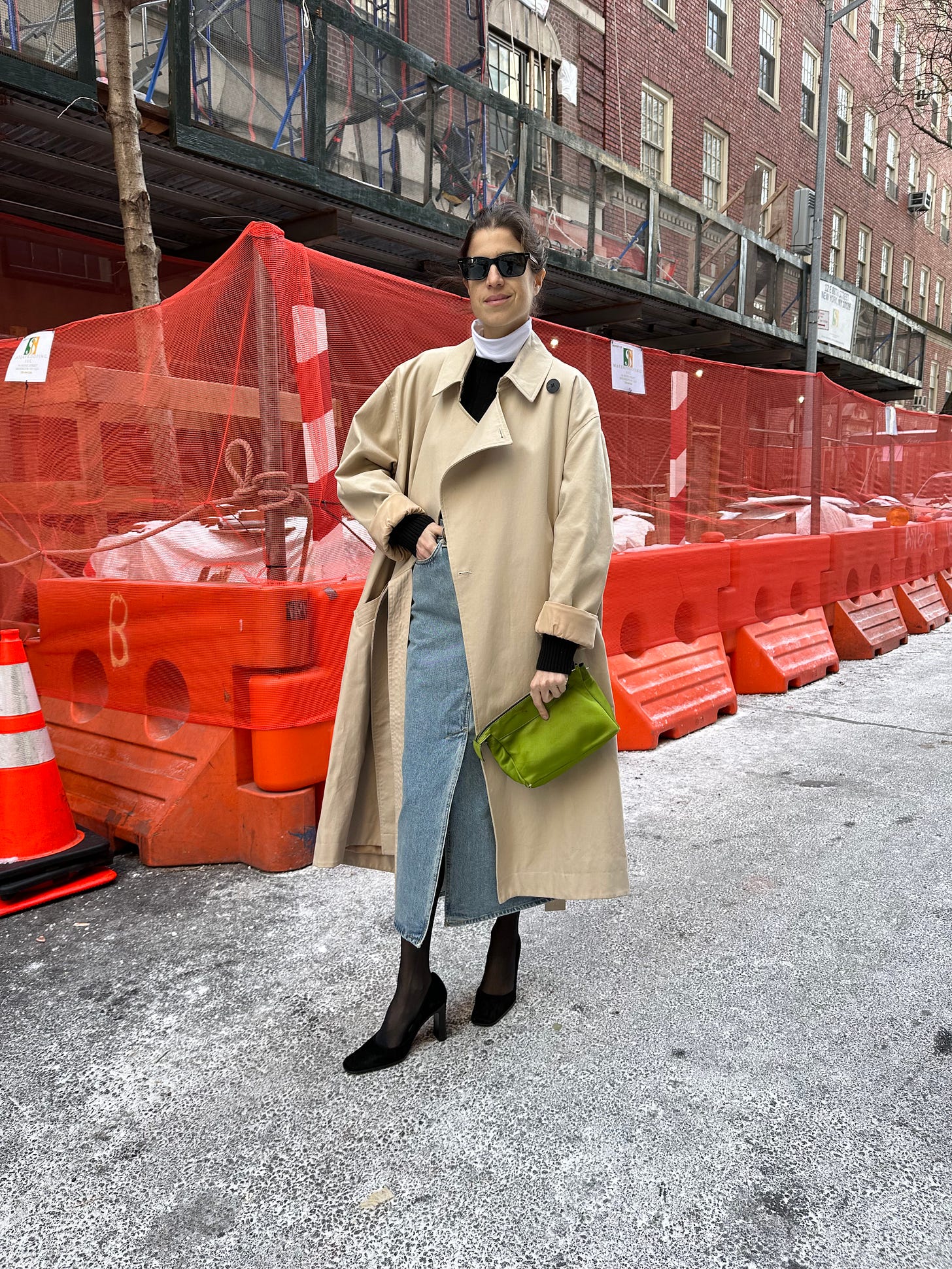
But it will pair well with navy or brown, too. Here’s with brown:
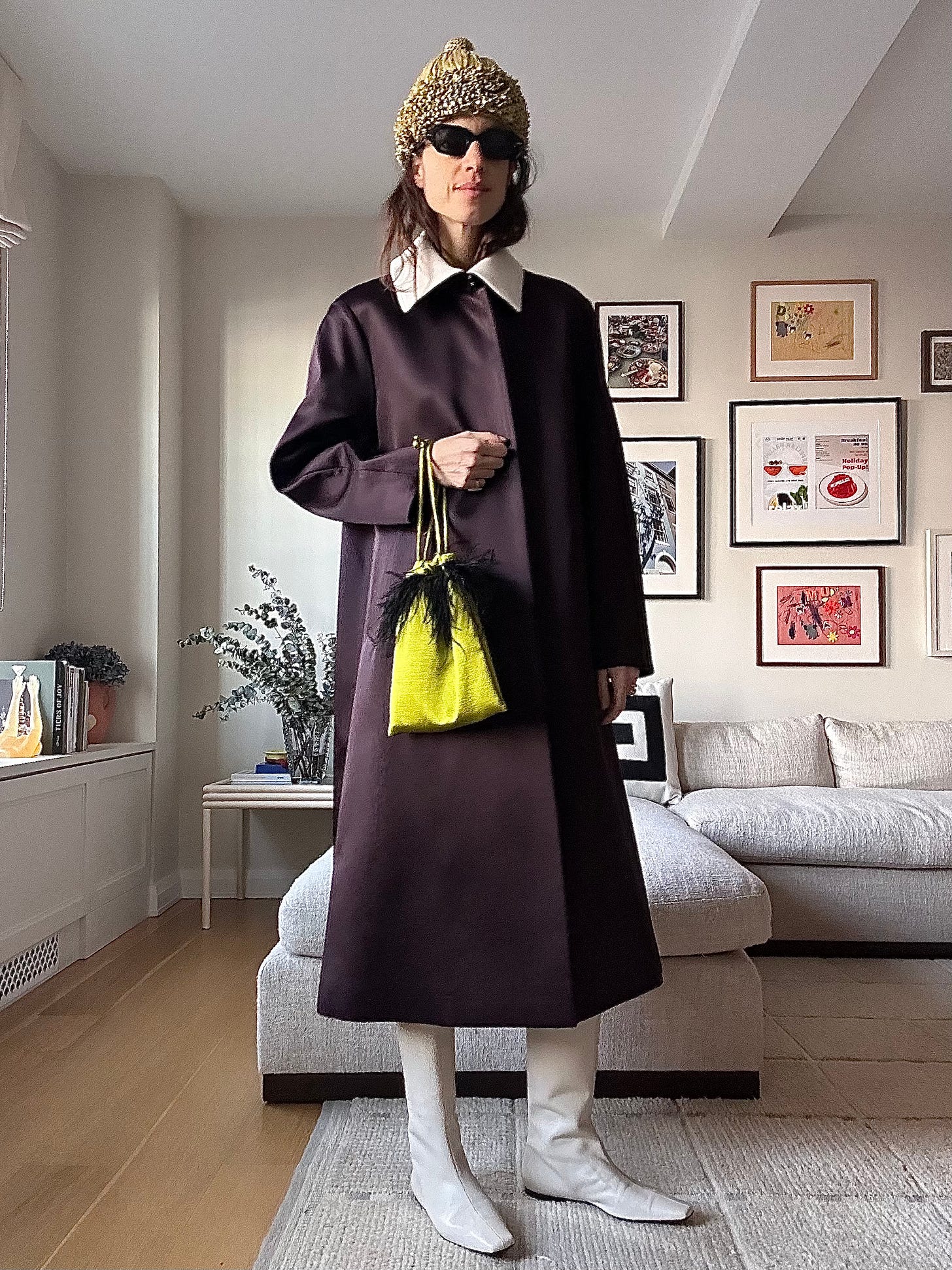
It’s less obvious (tree-like) with navy, and something about the navy gives the green an opp to really bathe in itself.

But I do think it’s the minor add of something shiny (gold shoes, but you could hit two birds with one stone with these) that gives the look more life.

The other thing I’ll say is re: material.


